Last updated by The POOG on January 04, 2021.
This article provides charts and graphs of ice and snow in their various forms and locations. Much of the data that we have on sea ice conditions does not go back (reliably) beyond the beginning of satellite observations in 1979. This means a lot of our data spans at most about 40 years.
Many of the components that affect climate such as the Pacific Decadal Oscillation (PDO) and the Atlantic Multidecadal Oscillation (AMO) are cyclical with a period greater than our period of ice observation.
Climate models have been changing since the first which were restricted by mandate to consider CO2 only. The next round of models will for the first time have a component for solar particle forcing. To date, the models have not been able to produce observable temperatures although the Russian model has been the best. Consequently, one must be very careful in determining and projecting trends. Our projections tend to be linear but the climate is the emergent effect of many different cyclical systems interacting.
Snow Cover
Here is a chart of the Northern Hemisphere snow cover anomaly, 1967-2020. Bars above the zero line indicate greater than normal cover. Bars below, the opposite.

It is noteworthy that a cyclical rather than a linear trend appears to exist. This does not correlate with trends in either temperature or CO2. It may correlate with Pacific weather events of the El Niño-Southern Oscillation (ENSO) more commonly known as El Niño and La Niña.
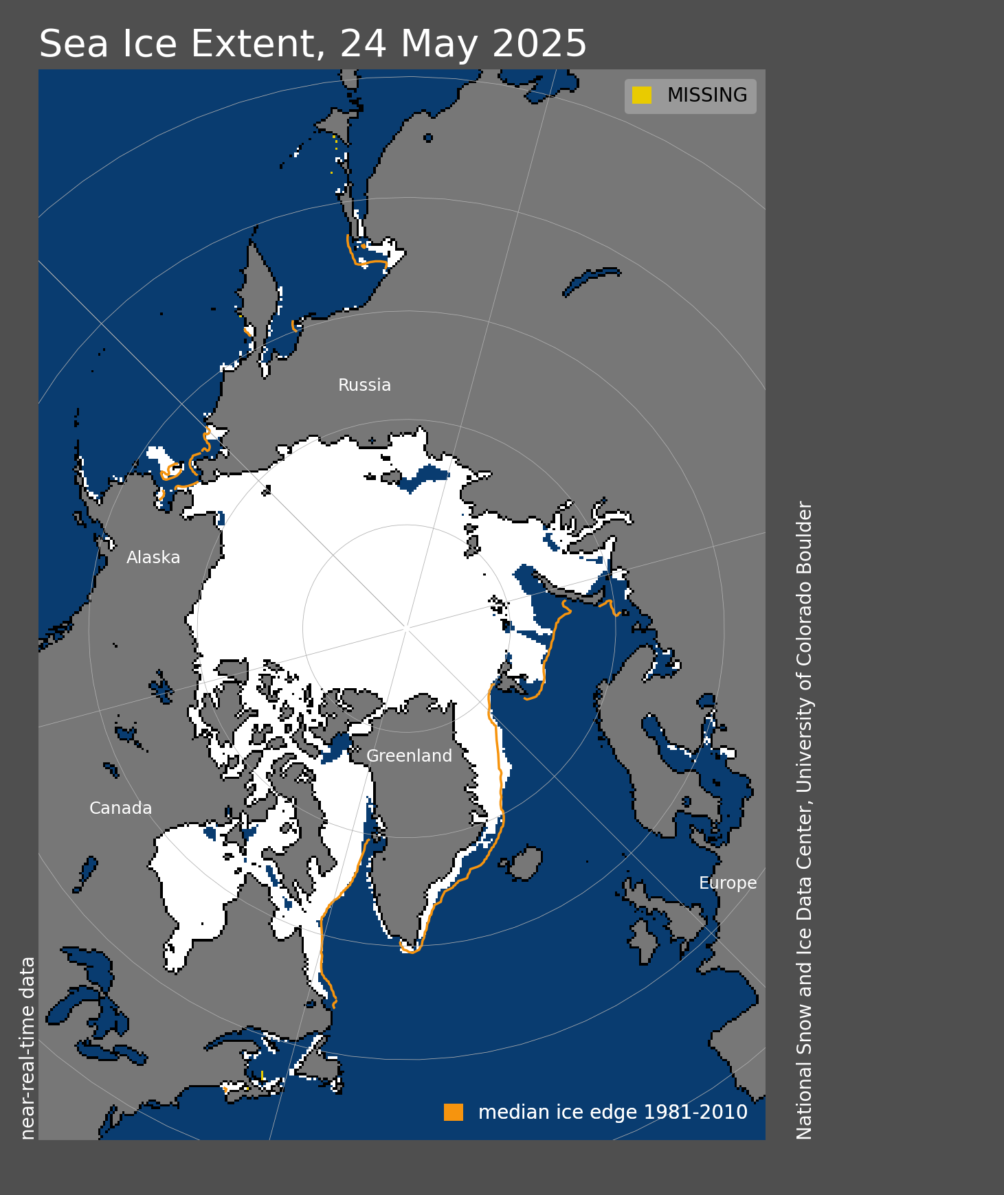
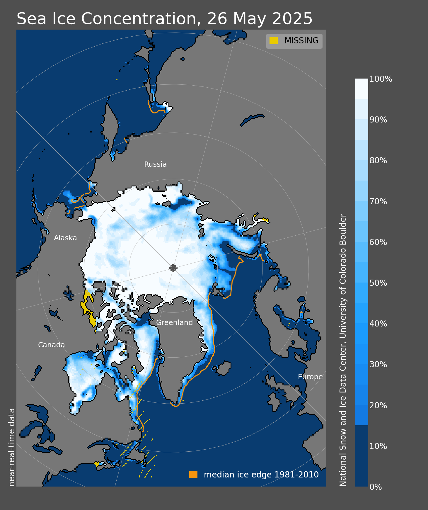
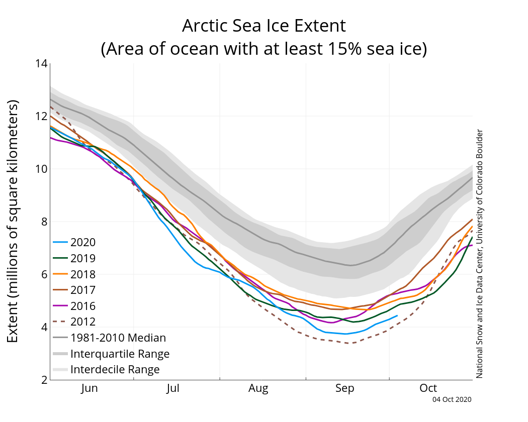
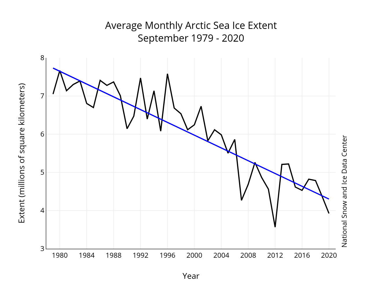
Arctic Sea Ice
Below are pictures and graphs of Arctic sea ice extent.
And from the Danish Meteorological Institute (DMI):
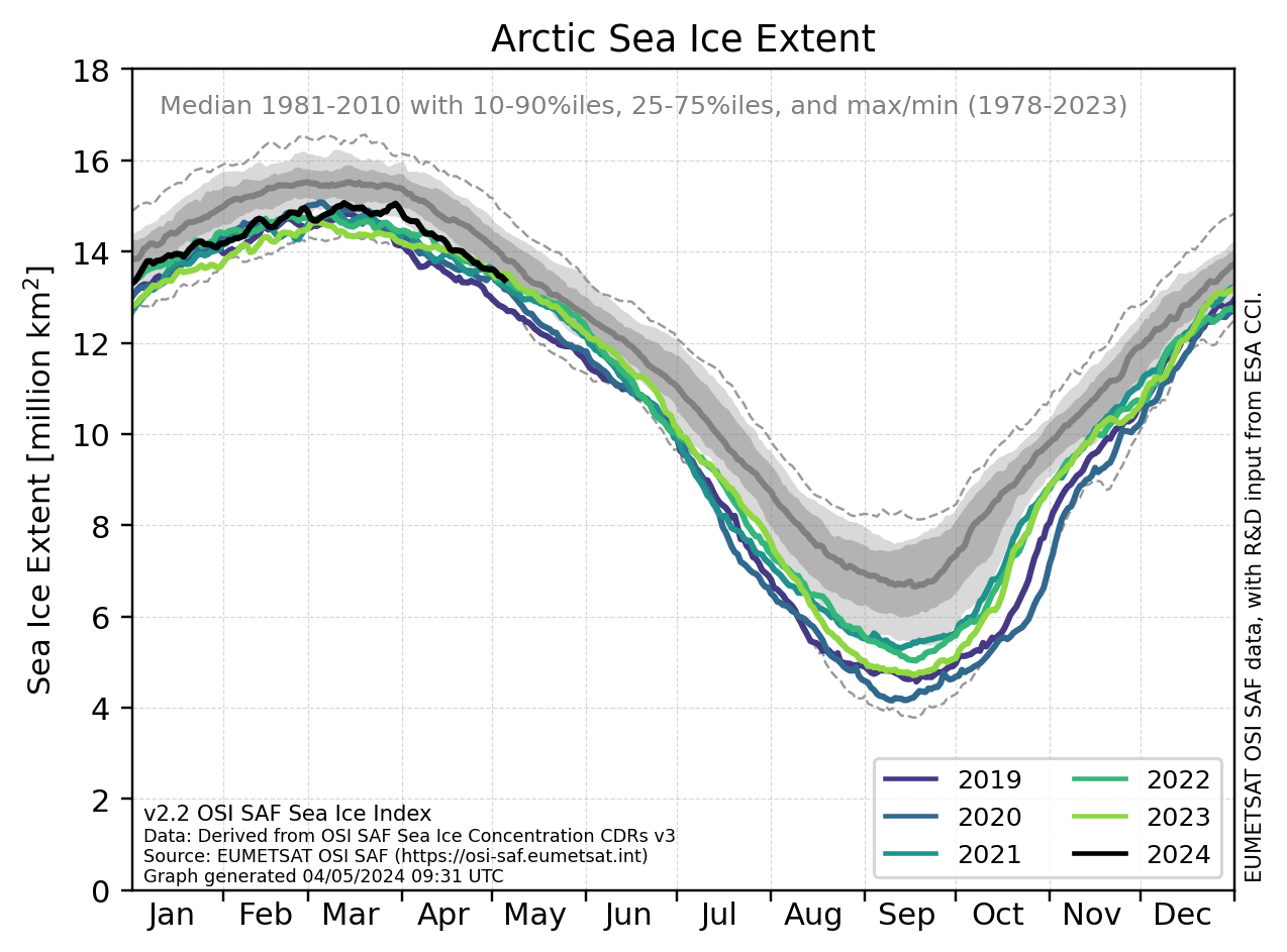
If we look at the black line, Climate Data Record, we see that it varies between about 5 million square kilometres to about 15 million square kilometres,. That’s a 200% range above the low.
All the above data is about ice extent. However, ice thickness or volume is also important. CryoSat Satellite measurements in 2013 found a 50% increase over the previous year showing how wide variations can be on an annual basis[3]. From an effect on sea level, it is the total volume and not the extent that is important.
Whereas Figure 5 shows the trend in extent, the following graph shows the trend in volume change. The graph does not show total volume but the annual change in volume.

It may be instructive to understand that ice volume changes by roughly z% over the year with a peak in may and a low in October.

Next, we show the change in thickness from year to year:
We note that data from the current range of years from 2006 is lower than the earlier years of 1980 and 1990 by a noticeable margin with 2020 showing data only into September.
I want to include one more chart that someone at the University of Waterloo has made by superimposing exponential trend lines over data. While the fit appears good to the end of the data, there is a problem:
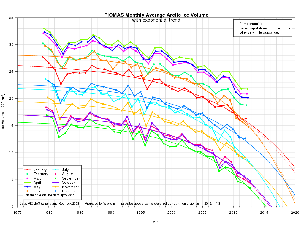
The exponential extrapolation of the data shows that by now (October 26, 2020), the Arctic should be ice-free for 6 months of the year. This is clearly not the case showing that exponential extrapolation is not a valid means of projecting trends in ice volume. A person not conversant with data analysis, however, might look at this figure and conclude that the Arctic is mostly ice free now and will be totally ice free in the near future.
Once again we are dealing with cyclical systems that cannot be approximated by simple linear or exponential functions.
North Atlantic Icebergs
The DMI has an interactive chart of iceberg distribution on a weekly basis as composed from satellite data. See the Iceberg Atlas and step through week by week. I assume week 1 is the first week in January. The menu bar has a national flag on the right that allows you to toggle the language used.
Antarctic Sea Ice
Although the media wishes to portray the Antarctic sea ice as precipitously declining, a 2016 study[6] of explorer log books from the early twentieth century revealed that there was little total difference over the century.
NASA provides the following map of current Antarctic sea ice extent:
NASA is notorious for altering data and skewing reporting to purportedly show ‘global warming’. I included a three-part video analysis by Tony Heller in my article Temperature showing how NASA alters data to fit a hypothesis.
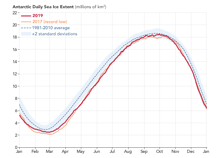
This graph gives another example of data manipulation called ‘cherry picking’. Look at Figure 4 above. As well as the 1981-2010 average, NASA shows the 6 most recent years of data on the graph.
Now look at Figure 7. There are only two recent years of data. This graph leaves out the years 2011 to 2016 and 2018. Why is this?
We find that NASA reported[1] that “the Antarctic sea ice yearly wintertime maximum extent hit record highs from 2012 to 2014 before returning to average levels in 2015“. So 2012, 2013, and 2014 were all years of “record high” ice coverage and 2015 was around the average. Choosing data the way they did by excluding 3 record high years belies the total observational effect in favour of their global warming agenda.
We might also look at a paper by a NASA employee, Claire Parkinson[2]. The first problem to note is the use of the term “far” in the title. The term is un-quantified and therefore meaningless in a scientific sense. I was once called up by my PhD advisor for using a similar term ‘significant’ in a paper that I was writing. I failed to explaining what it represented quantitatively.
Consider the lowest graph in Figure 8 below from her paper.

As she notes, the trend line is clearly increasing. However, while the last three data points are in a record low range for data going back to 1979 (the satellite era), the previous three points are in a record high range. And the last point has turned up. There are only two valid observations that one can make. The first is that the trend appears linearly increasing with data reversion to the mean. The second is that the variance from the mean has been increasing in amplitude since about 2000. This may indicate that the weather is becoming more extreme.
Glaciers and Ice Sheets
Antarctica
A 2015 NASA study[5] found that at that point, the Antarctic ice sheet was registering a net gain in mass.
Greenland
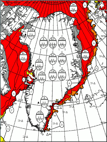
The DMI has an interactive map of Greenland that allows you to see Satellite Images of the Greenland coastal area. As well they have ice charts around Greenland as below:
Much has been made about melting of the ice sheet both inland and coastal. Now we have data that confirms that there is a mantle plume of heat coming up to the surface under the ice sheet. This is similar to volanic activity under the Antarctic ice causing melting from below. Scientists must now try and figure out the contribution of the plume to melting[7][8]][9].
Other Glaciers
Many glaciers are currently in retreat such as the Pine Island Glacier[4].
Links
- Arctic Sea Ice Graphs
- Canadian Cryospheric Information Network (CCIN)
- Danish Meteorological Institute (DMI). In English. Data on both Arctic sea ice and the Greenland ice sheet.
- National Snow and Ice Data Center (NSIDC)
- Polar Science Center (PSC)
- Rutgers University Global Snow Lab.
References
- Antarctic Sea Ice Reaches New Record Maximum. NASA, Oct. 7, 2014.
- Claire L. Parkinson (2019). A 40-y record reveals gradual Antarctic sea ice increases followed by decreases at rates far exceeding the rates seen in the Arctic. PNAS, July 1, 2019.
- Robert Wilde. CryoSat Satellite Finds Arctic Ice Increased 50% in Volume. Breitbart, 17 Dec 2013.
- J. A. Smith et al, Sub-ice-shelf sediments record history of twentieth-century retreat of Pine Island Glacier, Nature (2016). DOI: 10.1038/nature20136.
- NASA Study: Mass Gains of Antarctic Ice Sheet Greater than Losses. NASA, Oct. 30, 2015.
- Watts A. Old explorer logbooks reveal Antarctic sea ice unchanged from over a century ago. Watts Up With That?, November 25, 2016.
- Toyokuni G, Matsuno T, Zhao D. P Wave Tomography Beneath Greenland and Surrounding Regions: 2. Lower Mantle. AGU. 30 October, 2020; https://doi.org/10.1029/2020JB019839.
- Heat flow from Earth’s mantle contributes to Greenland ice melting. Phys.org. August 11, 2013.
- Newly discovered Greenland plume drives thermal activities in the Arctic. Phys.org. December 07, 2020.